January 14

Advertising Photography and Proposal

I am representing ATM Click skateboards. Been supplying skaters with sturdy, pop easy decks since 1992. The product I am advertising is the new 8.5 deck with deep concaves and a new shaped tail and nose. My target audience is kids or adults interested in skateboarding or learning. I would expect to see this advertisement in Thrasher or Free Skate magazine and on Social Media. For this picture, I will use natural light and with some editing, touch up the brightness and contrast between the board and the background. I will need the new 8.5 deck, someone who can skate, and a street with good exposure to light.

January 13

Online Advertising

This ad caught my attention because of the movement of the Gin and the falling chilis and limes. I like that the bottle almost blends into the background but has rim lighting. It kept my attention enough to read what the bottle says.
This as caught my attention because of the bright color of the nail polish. The background trailed my eyes to the product and kept me there. I really like the drip of the polish and that they used another nail polish bottle to hold up the brush. The middrop really really enhances the interest in the color itself.
This ad was my favorite. The fact that they have included surrealism to show the most prominent flavor was, in my opinion, genius. The placement is interesting as well. Whether intentional or not, they also show the durability of the glass by giving us the thickness and really appeals to the eye.
December 7

Pop Art

This pop art is of my Pitbull Tiki.
See the source image
1.) What is Pop Art?
Pop Art is art based on modern popular culture and the mass media that usually has bold colors and lines.
2. Why is this artist’s work considered Pop Art?
This is considered pop art because Marilyn Monroe is widely known and there is bold colors and lines.
3. Describe some of this artists work.
This artist enjoys to take widely know people and throws his own twist one it. Like the one above, he has another one of Elvis Presley with a alligator on his shoulder that is chewing on an arm.
4. Why did you pick this artist and why do you like his/her work?
I chose his work because I enjoy how he think outside of the box to make iconic images his own. Rather than just adding color, he adds context and tells a story. Like the one above, his work makes you think beyond the picture and ponder on the back story of the characters.
December 6

HDR

This picture was taken when there was a slight breeze so it created this cool effect with the palm branches. It made them almost look like they are glitching or faded. This particular photo I took is one of my better shots. I say this because it has good composition and editing. For example, the roof creates a diagonal and trees catch the eye with the red and green highlights. Also, the clouds look authentic. When I was looking for clouds to use in this shot, I couldn’t find any that were subtle enough to bring a certain level of authenticity. But after an hour of looking, I found the right ones. In total, I am pleased with the editing and shot itself. I believe if makes for a good HDR photograph.
See the source image
This photo from the internet show good HDR. HDR stands for High Dynamic Range. Dynamic range refers to the difference between the light elements and dark elements in a scene. A high dynamic range would be with both very light and dark dynamics, as a low dynamic range would be with extremely light or dark elements.
November 18

Shoot Like Aaron Siskind

Manual, 1/50 sec, f/5.6, 50mm, ISO 1600
This picture shot by Aaron Siskind has a very distinct vibe to it. The way he made the face look like it is peeling or flaking off to me makes me think of her shedding her skin to become a new person. Or it could mean shedding past trauma.

November 8

Photojournalism

The two girls share their new songs and laugh at the dramatic melody.
After the argument, one of the girls walks to class leaving the other to watch her leave.
As the spiker experiments during practice, his teammate is ready to support him with a solid receive.

November 8

JPEG vs. Raw

JPEG is the most common file format due to its good quality ad compression ratio for storing realistic images. This file format compresses in order to reduce the file size without loosing quality. The file size would be about 10 to 40 percent of the original photo. JPEG is recognized by programs for viewing photos since the photo is close to finished and is ready to be printed. But because JPEG compresses the file, it often looses data and quality, leaving a small margin for editing. Resulting in the more inferior file format compared to Raw.

On the other hand, Raw is not really a file format but simply a direct output from the sensor written into a file without processing or compression. A Raw photograph would be the size of the original photo in order to keep all original effects on the photograph. They can only be read by few programs meant for editing photos, resulting in the photo looking badly shot or with low contrast. But on the other hand, professionals prefer Raw because they don’t print the photos right away. Raw allows them to process it to make it look how they intended it too, giving the photography large margins for editing and enhancement. This is truly where Raw shines the brightest.

November 4

Portrait Photography Tips

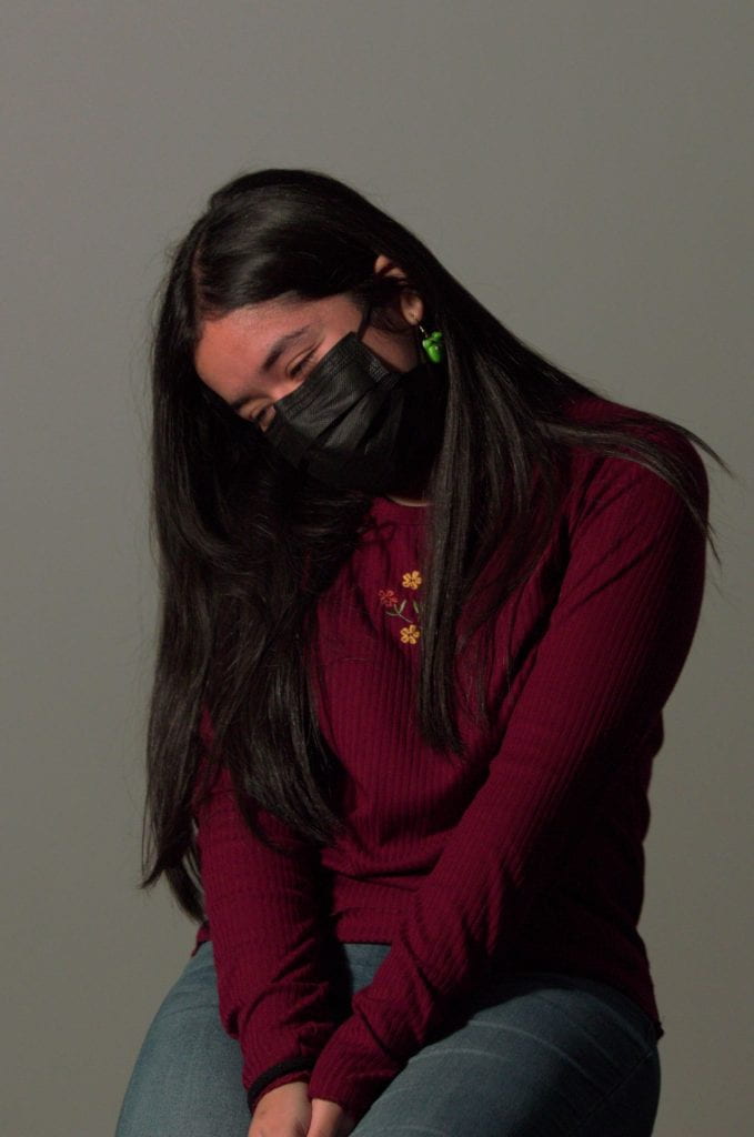
The quality of the light, soft or harsh, warm or cool, direct or diffuse, has a significant effect of the shot. When shot right, natural light can completely evolve a photo. To start you need an understanding of how light interacts with your subject. In order to better your Portrait shots here are some tips.

“Watch and learn how light behaves and moves.” Don’t be afraid of natural light and keep practicing! Try to keep the sun behind your subject and avoid open shade. Open shade makes the shot look flat and removes the desired dimension. When shooting on a cloudy day, tilt your subjects head towards the sky or have a reflector at hand. When indoors use windows to your advantage.

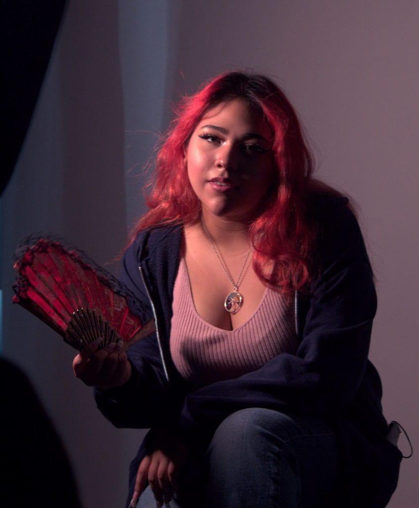
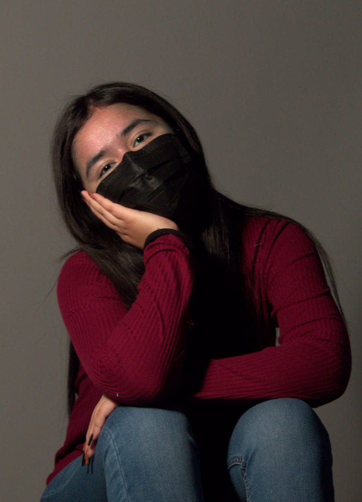
“A curtain can be a great way to diffuse natural light.” You can use various thing to reflect light, including styrofoam, aluminum foil, cardboard, mirrors, etc. Using a curtain to diffuse light rather than the flash gives the subject more depth.

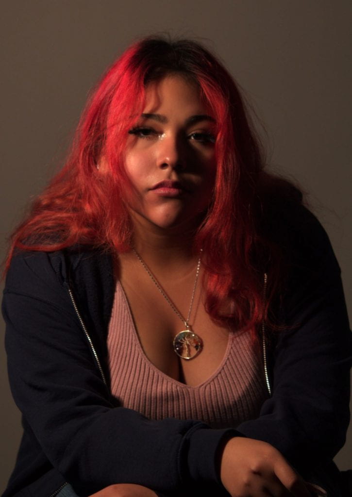
“When using a reflector, avoid lighting the model from below.” Don’t expect great results without the practice and understanding of light! Using a reflector from above the subjects head helps give of more natural shadows. Your background should not have bright or vibrant spots.

“Keep an eye on how the atmosphere of a shot changes with the light.” When working with light you need patience and the will to experiment with the shots! When you choose what you want to shoot, take pictures in different time of the day and different weather. By doing this, you’ll get practice with how to photograph in these conditions with the natural light provided.

“Arrive at the location in advance, and take your photos at sunset, sunrise, and blue hour.” To determine where the sun will be you can download accurate apps that will help determine the time of day you want to shoot. Spend a few days at the scene and get used to the weather. Don’t forget, use the weather to your advantage!

“Usually, I just try to keep it as simple as possible and work with the light that is already there.” Knowing how to take advantage of natural light is very helpful when shooting real estate, architecture, and interior scenes. If you don’t use strobes or speedlights, you’ll need a bracket to block the light from the windows.